Introduction
The standard approach to teaching (and thus thinking about) statistics is based on projecting distributions of expected values. The distribution of an expected value is a set of probabilities that predict the relative chance of each possible value, according to a mathematical model of what you predict should happen.
For example, the Binomial model predicts the chance of obtaining f instances of a type, A, drawn from n instances of two types, A and B, assuming each instance in the sample is independent from the next, the population is infinite in size, and any random instance could be either A or B.
For the experimentalist, this distribution is the imaginary distribution of very many repetitions of the same experiment that you have undertaken. It is the output of a mathematical model.
- Note that this idea of a projected distribution is not the same as the ‘expected distribution’. An expected distribution is a series of values you expect your data should match, according to your null hypothesis.
- Thus in what follows we simply compare a single expected value P with an observed value p. This can be thought of as comparing the expected distribution E = {P, 1 – P} with the observed distribution O = {p, 1 – p}.
Thinking about this projected distribution represents a colossal feat of imagination: it is a projection of what you think would happen if only you had world enough and time to repeat your experiment, again and again. But often you can’t get more data. Perhaps the effort to collect your data was huge, or the data is from a finite set of available data (historical documents, patients with a rare condition, etc.). Actual replication may be impossible for material reasons.
In general, distributions of this kind are extremely hard to imagine, because they are not part of our directly-observed experience. See Why is statistics difficult? for more on this. So we already have an uphill task in getting to grips with this kind of reasoning.
Significant difference (often shortened to ‘significance’) refers to the difference between your observations (the ‘observed distribution’) and what you expect to see (the expected distribution). But to evaluate whether a numerical difference is significant, we have to take into account both the shape and spread of this projected distribution of expected values.
When you select a statistical test you do two things:
- you choose a mathematical model which projects a distribution of possible values, and
- you choose a way of calculating significant difference.
The problem is that in many cases it is very difficult to imagine this projected distribution, or — which amounts to the same thing — the implications of the statistical model.
When tests are selected, the main criterion you have to consider concerns the type of data being analysed (an ‘ordinal scale’, a ‘categorical scale’, a ‘ratio scale’, and so on). But the scale of measurement is only one of several parameters that allows us to predict how random selection might affect the sampling of data.
A mathematical model contains what are usually called assumptions, although it might be more accurate to call them ‘preconditions’ or parameters. If these assumptions about your data are incorrect, the test will probably give an inaccurate result. This principle is not either/or, but can be thought of as a scale of ‘degradation’. The less the data conforms to these assumptions, the more likely your test is to give the wrong answer.
This is particularly problematic in some computational applications. The programmer could not imagine the projected distribution, so they tweaked various parameters until the program ‘worked’. In a ‘black-box’ algorithm this might not matter. If it appears to work, who cares if the algorithm is not very principled? Performance might be less than optimal, but it may still produce valuable and interesting results.
But in science there really should be no such excuse.
The question I have been asking myself for the last ten years or so is simply can we do better? Is there a better way to teach (and think about) statistics than from the perspective of distributions projected by counter-intuitive mathematical models (taken on trust) and significance tests?
The traditional approach
One of the simplest statistical models concerns Binomial distributions. I find myself writing again and again about this class of distributions (and the mathematical model underpinning them) because they are central to corpus linguistics research, where variables mostly concern categorical decisions.
But even if you are principally concerned with other types of statistical model, bear with me. The argument below may be applied to the Student’s t distribution, for example. The differences lie in the formulae for computing intervals. The reasoning process is directly comparable.
The conventional way to think about a Binomial evaluation is as follows.
- Consider the true rate of something, A, in the population out of an outcome or choice {A, B}, represented by a population proportion P.
- We could write P(A | {A, B}) to make this clearer, but for brevity we will simply use P.
- Note that the true rate P could conceivably be 0 or 1, i.e. all cases might be B, or all cases A.
- Use the Binomial function to predict, probabilistically, the likely distribution of P.
- This is the projected distribution of P.
- Perform a test for a particular observation, p, that tells us how likely it is that p is consistent with that distribution, termed the ‘tail probability’.
- If P > p we typically want to know how likely it is that P is consistent with any value from 0 to p.
- If P < p, we work out the chance of randomly picking a value from p to 1.
This particular test is called the Binomial test.
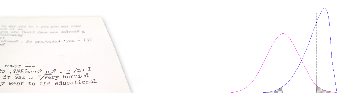
Below is an example, taken from an earlier blog post, Comparing frequencies within a discrete distribution. This particular evaluation models the Binomial distribution for P = 0.5 and n = 173 (the amount of data in our sample, termed the sample size).
The Binomial distribution (purple hump) is the distribution we would expect to see if we repeatedly tried to sample P, i.e. we repeated our experiment ad infinitum.
That is what we mean by a ‘projected distribution’. We can’t see it, and we can’t construct it by repeated observation because we have insufficient time!
The height of each column in this distribution is the chance that we might observe any particular frequency, r ∈ (0, n), whenever we perform our experiment. For the maths to work, we assume that every single one of the n cases in our sample is randomly and independently sampled from a population of cases whose mean probability was P.

The values we would most likely observe are 86 and 87 (173 × 0.5 = 86.5). In this case, p cannot be 0.5, even if this is the ‘expected value’ P!
However, the chance of either of these values being obtained is pretty small — 0.06. There is a range of values to either side of P where we would expect to see p fall. What the pattern shows us is that, say, a value of r = 60 or less is very unlikely to have occurred by chance.
The formula for the Binomial function looks like this:
Binomial distribution B(r) = nCr Pr (1 – P)(n – r). (1)
This function generates the probability that any given value of r will be obtained, given P and n. For more information on what these terms mean, see Wallis (2013).
Next, we consider our particular observation, which might be expressed as a frequency, f = 65 or proportion p = f / n = 0.3757.
Now, the conventional approach to this test is to add up all the columns in the area greater than or equal to p, or from 0 to 65 (see the box in the figure above). This ‘Binomial tail sum’ area turns out to be 0.000669 to six decimal places. So we can report that there is less than a 0.000669 chance that this observation, p, was less than P due to mere random chance. In other words, we can say that the difference p – P is significant, at an error level α < 0.05.
Since this calculation is a little time-consuming and computationally arduous to carry out with large values of n, for over 200 years researchers have used an approximation credited to Carl Friedrich Gauss, namely to approximate the chunky Binomial distribution to another, smooth distribution, called the Gaussian or ‘Normal’ distribution.
In the graph below, the Gaussian distribution is plotted as a dashed line. As you can see, in this case the difference between the two shapes is almost imperceptible.

But now we can dispense with all that complicated ‘adding up of combinations’ that the Binomial test requires. The Gaussian approximation calculates the standard deviation of the Normal distribution, S, using a very simple function. On a probabilistic scale this calculation looks like this.
S = √P(1 − P)/n , (2)
S = √0.25 / 173 = 0.0380.
The Normal distribution is a regular shape that can be specified by two parameters: the mean and the standard deviation. We have mean P = 0.5 and standard deviation S = 0.0380.
Now we can apply a further trick. To perform the test, we don’t actually need to add up the area to the left of p. That’s a lot of work. All we need do is work out what p would need to be in order for the difference p – P to be just at the edge between significance and non-significance. At this point, the area under the curve will equal a given threshold probability, α/2 of the total area under the curve, where α represents the acceptable ‘error level’ (e.g. 1 in 20 = 0.05, 1 in 100 = 0.01 and so on). This area is half of α because, as the graph indicates, there will be another similar ‘tail area’ at the other side of the curve.
In simple terms, the area shaded in pink in the graph above is half of 5% of the total area under the curve, or — to put it another way — if the true rate in the population P was 0.5, the chance of a random sample obtaining a value of p less than the line to the right of that area is 0.05/2 = 0.025. (In our graph we have scaled all values on the horizontal axis by the total frequency, n, but this just means we multiply everything on a probability scale by n!)
How do we work this out? Well, we use the critical value of the Normal distribution, which we can write as zα/2 or, less commonly, Φ-1(α/2), where Φ(x) is the Normal cumulative probability distribution function. This allows us to compute an interval where (1 – α = 95%) of the area under the curve is zα/2 standard deviations from P.
For α = 0.05, this ‘two-tailed’ value is 1.95996. The Normal interval about P is then simply the range centred on P:
(P–zα/2.S … P … P+zα/2.S) = (0.4245, 0.5745).
Since p = 0.3757 is outside this range, we can report that p is significantly different from P (or p – P is a significant difference, which amounts to the same thing). This is more informative than saying ‘the result is significant’. But crucially, it relies on us pre-identifying a value of P, which we cannot obtain from data!
We have marked this out in the graph above, again, multiplying by n.
The conventional approach to statistics focuses on the mathematical model, and the projected distribution. Is there another way?
The other end of the telescope
An alternative way of thinking about statistics is to start from the observer’s perspective.
Most of the time we simply do not have a population value P, but we always have an observation p. In our example we assumed P was 0.5 for the purposes of the test — to compare p with 0.5. But this is a very limited application of statistics. What if we don’t know what P is? We only have observations to go on.
Conclusion: Instead of focusing on the projected distribution of a known population value, we should focus instead on projecting the behaviour of observed values.
The following graph plots the Wilson score distribution about p, using a method I developed in an earlier blog post. That distribution (blue line) may be given a confidence interval (the Wilson score interval) with the pink dot in the centre. We have plotted the equivalent 95% interval as before, so, again, 2.5% of the area under the curve can be found in the tail area ‘triangle’ above the upper bound (vertical line), and 2.5% of the area under the curve is found in the tail area below the lower bound.

The confidence interval for p (indicated by the line with the pink dot) is:
95% Wilson score interval (w–, w+) = (0.3070, 0.4498),
using the Wilson score interval formula (Wilson 1927):
Wilson score interval (w–, w+) ≡ p + z²/2n ± z√p(1 – p)/n + z²/4n²
1 + z²/n,
(3)
where z represents the error level zα/2, shortened for reasons of space.
This particular distribution looks very similar to the Normal distribution. However, it is a little squeezed on the left hand side. It is asymmetric, with the interval widths being unequal:
y– = p – w– = 0.3757 – 0.3070 = 0.0687, and
y+ = w+ – p = 0.4498 – 0.3757 = 0.0741.
For more information, see Plotting the Wilson distribution.
What does this interval tell us?
In our sample, we observed p = 0.3757 as the proportion p(A | {A, B}) = 65/173.
On the basis of this information alone, we can predict that the range of the most likely values for P in the population from which the sample is drawn is between 0.3070 and 0.4498, if we make this prediction with a 95% level of confidence.
The value w– represents the lowest possible value of P consistent with the observation p, i.e. that if P < p, but P > w–, we would report that the difference was not significant.
Similarly, the value w+ is the largest possible value of P consistent with p.
- Aside: We can scale the interval to the frequency range (0…173), i.e. approximately (53, 78). However, since we are mostly interested in values of a proportion out of any sample size (a future sample might be twice as large, say), for practical reasons it is better to keep the interval range probabilistic.
Note that we have dispensed with any need to consider the actual population proportion, P. We don’t need to know what it is. Instead we view it, through our ‘Wilson telescope’, from the perspective of our observation p. The picture is a bit blurry, which is why we have a confidence interval that stretches over some 10% of the probability scale. But we have a reasonable estimate of where P is likely to be.
If we want to test p against a particular value, say, P = 0.5, we can now do so trivially easily. It is outside this range, so we can report our observation p is significantly different from P = 0.5. If we plot data with score intervals, we can even compare observations by eye.
Statistics from the observer’s point of view
Consider the following thought experiment.
As an adult, you meet up with a bunch of random friends you haven’t seen for several years. Twenty in all, with nothing particular to connect them together.
For the sake of our thought experiment, let us assume this group of friends are twenty random individuals drawn from the population, but if they all went to the same school we might be concerned about whether they only represented a more limited population!

It turns out, as you chat, that 5 out of 20 had chicken pox (varicella) as a child. (Chicken pox is a childhood disease, immunisation is widespread and few adults slip through the net, so anyone over 20 can be assumed to be unlikely to get it by that age).
On the basis of this observation alone, what is the most likely rate of chicken pox in the population? Can we be 95% confident it is less than half?
To work out the answer, we know two facts: p = 5 / 20 = 0.25, and n = 20.
Using Equation (3), this gives us
95% Wilson score interval (w–, w+) = (0.1186, 0.4687),
which excludes 0.5, so the 95% interval is indeed less than half. (With a correction for continuity, the interval becomes (0.0959, 0.4941) — still below 0.5).
If you think about it, this conclusion is at one and the same time, remarkably powerful — and counter-intuitive.
How can it be that, with only 20 people to go on, we can be so definite in our conclusions?
- The answer is that the Wilson interval is derived from the Normal approximation to the Binomial, and the Binomial is itself based on simple counting of the different ways we can obtain a particular frequency combination. See Binomial → Normal → Wilson.
In many ways the idea of an interval about an observation p is just as curious as the idea of an interval about P. Both are based on the counterintuitive idea that simple randomness leads to a predictable degree of variation when data is sampled.
- Note that we can test this question in other ways. For example, we could use the Normal approximation to the Binomial with P = 0.5 to perform a test, but this would not give us the range of likely values of P.
The Wilson interval on p has many more applications than either traditional tests or intervals on P. This is simply because, as we noted earlier, most of the time we simply do not know what P is.
Application 1: comparing intervals
For example, we can compare Wilson intervals using what I have elsewhere referred to as the Wilson score interval comparison heuristic:-
For any pair of proportions, p1 and p2, check the following:
- if the intervals for p1 and p2 do not overlap, they must be significantly different;
- if one point is inside the interval of the other, they cannot be significantly different;
- otherwise, carry out a statistical test to decide whether the result is significantly different.
What this means is that in many cases we don’t need to perform a statistical test to compare them. We can simply ‘eyeball’ the data. We can also use confidence intervals to perform tests, like the Newcombe-Wilson test.
Application 2: estimating necessary sample size (statistical power)
Armed with our new-found mathematical understanding of statistics, we can also ask other, related questions.
For example, we might ask how much data would we need to conclude that an observation of p = 0.25 allows us to conclude that P < 0.5?

To get the answer, I have plotted the upper and lower bound of the Wilson score interval for n as multiples of 4 (our observation concerns whole numbers, remember). For good measure I have included the error level α = 0.01 alongside 0.05. We can clearly see the asymmetry of the interval.
We can see that for α = 0.05, we only need n = 16 guests at our get-together to justify a claim that the population value P is below 50%, but at α = 0.01, we need 28 guests. (This is proof positive that anyone who demands a smaller error level needs more friends!)
Concluding remarks
Does this all mean we should dispense with significance tests altogether and replace them with confidence interval analysis? This is something that many in the ‘New Statistics’ movement claim. I argue against this because not all tests can be substituted for confidence interval comparisons. For example, the z test summarised above can also be carried out using a 2 × 1 χ² test computation. But for r > 2, an r × 1 χ² test is not the same as a series of 2 × 1 tests.
Dispensing with tests altogether is premature, but a focus on confidence intervals on observed data is a much better way to engage statistically with data than ‘black-box’ tests.
References
Wallis, S.A. 2013. Binomial confidence intervals and contingency tests: mathematical fundamentals and the evaluation of alternative methods. Journal of Quantitative Linguistics 20:3, 178-208. » Post
Wilson, E.B. 1927. Probable inference, the law of succession, and statistical inference. Journal of the American Statistical Association 22: 209-212.
